
By Jeff Blankenship On Message Strategy
Most marketing gets ignored. It slides past the eye, past the brain, and into the void. It never earns a second look, much less a response.
That’s the problem compelling design solves. And if you’re investing anything in marketing — time, money, creative energy — it’s worth understanding exactly how it works. Because the principles are consistent, learnable, and repeatable.
First things first: What makes design compelling?
At Counterpart, we rally around four qualities of strong marketing: customer-centric, clear, compelling, and controlled. We call them the 4 Cs of message strategy, or The 4 things that make a message work™. And compelling has to come first. Because if you don’t earn a second glance, the other three never get a chance.
First, let’s be specific about what “compelling” actually means. Compelling design stops and moves. It forces the audience to pause — and to feel something that makes them want to stay.
That pause (even a fraction of a second) is the entry point. But the best work doesn’t just earn a glance. It creates a response.
Compelling design pulls you in. It might show you something unexpected, or something you recognize immediately. Something that makes you feel seen, or something you want to figure out.
There’s more than one way in. Let’s walk through them.
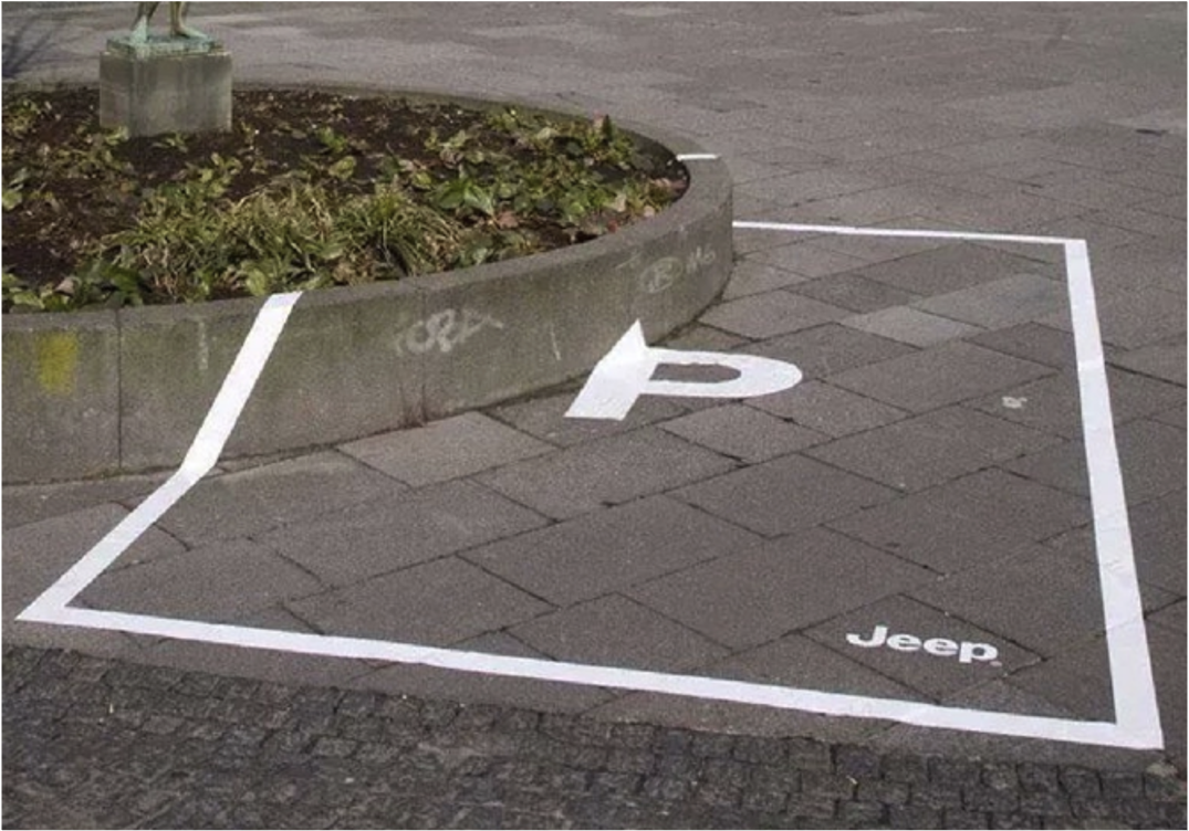
Ads that make you think: The power of puzzles
In some of the strongest, most compelling design work, the idea isn’t immediately apparent. You have to engage with it.
When a message leaves a small, deliberate gap, something interesting happens. You have to fill in the missing piece or interpret something that isn’t spelled out. It’s an invitation to participate. And when you do — and you have a click of recognition, an “oh, I get it!” moment — it creates a sense of ownership that passive messages never achieve.
You didn’t just see it. You figured it out. And things you figure out, you remember.

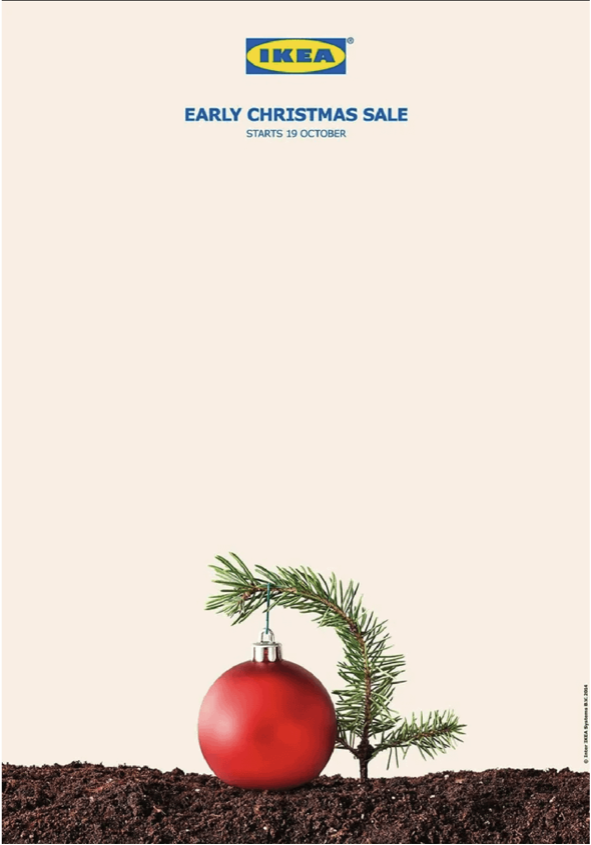
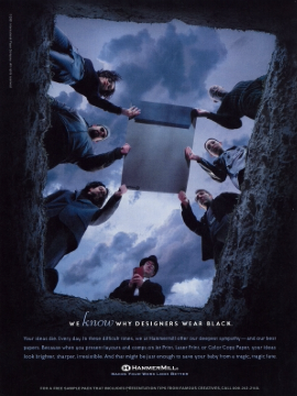
Visual hierarchy in graphic design: Control what people see first
In every layout, the designer has made a decision about what gets seen first. Done right, it can make a piece of marketing memorable.
Strong visual hierarchy:
- Establishes a clear sequence for the eye to follow
- Uses negative space to isolate what matters most
- Removes everything that competes with the primary message
In this example, a headline sits next to the man in the middle. Your eye goes straight to it. Then you see the “subhead,” with the laughing couple above. That’s when understanding hits. The visual hierarchy is a powerful tool that carries the message.
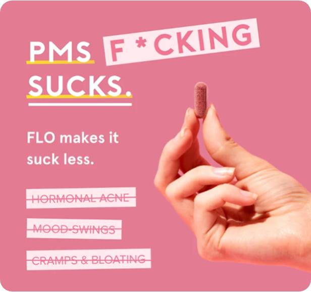
Niche marketing examples: Relevance makes people feel seen
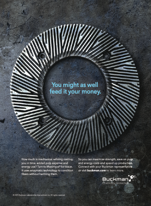
Most people would scroll or thumb past this ad without a second thought. But for the exact audience it’s meant for (engineers, procurement managers, operations leads in that specific vertical) it’s immediately meaningful. And the signal it sends is powerful:
“This message was built for you.”
That level of specificity is a form of respect. It says the advertiser knows their audience well enough to speak their language. And it creates a pull that broad, general messaging can never replicate.
This is one of the core reasons B2B marketing benefits from restraint. You’re not trying to speak to everyone. You’re trying to speak unmistakably to someone. The more specific the reference, the more compelling it becomes for the right audience — and the less it matters if everyone else scrolls past.
B2B marketing benefits from restraint. You’re not trying to speak to everyone. You’re trying to speak unmistakably to someone. The more specific the reference, the more compelling it becomes for the right audience.
Visual storytelling: When an image does the heavy lifting
Some of the most effective marketing barely has any copy. The image carries the message. The words, if any are needed, just reinforce it.

We process images faster than language. Our brains read a scene before they read a sentence. A strong visual communicates meaning, tone, and emotional context in a way that paragraphs of copy couldn’t.
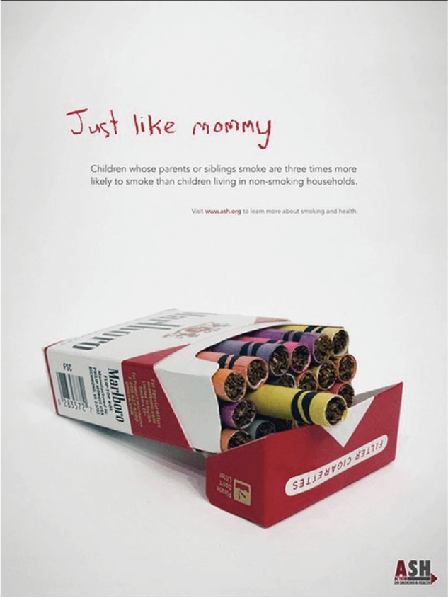
Sometimes the headline itself functions as an image, as in this example. Then the main image completes the message: Kids do what they see their parents do.
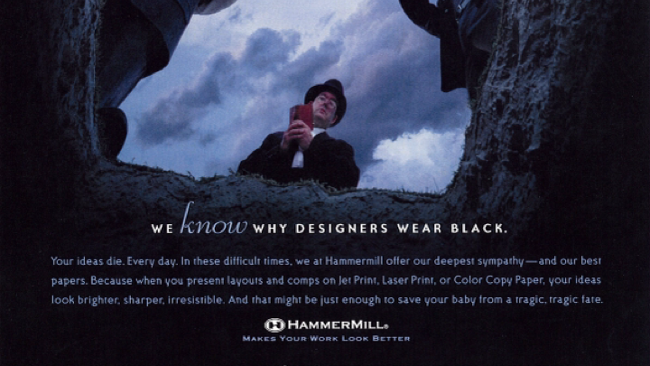
This ad delivers a double whammy. First, a gut punch when you realize you’re in the grave. Then humor when you see the message. And if you’re the target audience, you’re already in on the joke, so everything above about puzzles and relevance apply also.
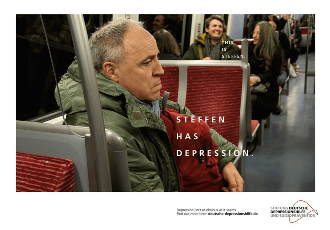
And here’s one that communicates emotion through empathy. It says what everyone in the target audience is thinking. It gets attention by telling it like it is.
Long-form ad copy: When the copy is the design
Just as there are times when you don’t need any copy to make a visual ad work, there are times when you don’t need much of a visual. If you have a compelling opening, it’s nearly impossible to look away from long-form copy. These two ads are proof.
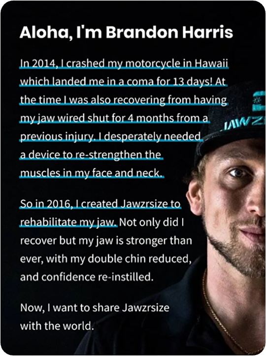
This example opens with: “In 2014, I crashed my motorcycle in Hawaii.” That’s all it takes. You want to know what happened.
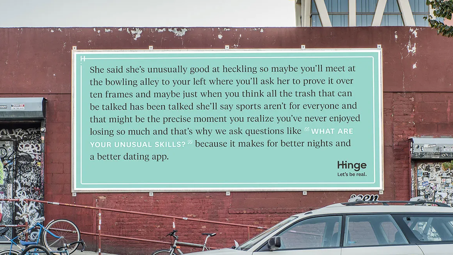
This Hinge billboard takes a different approach: one long unpunctuated sentence that mimics the actual feeling of a good date.
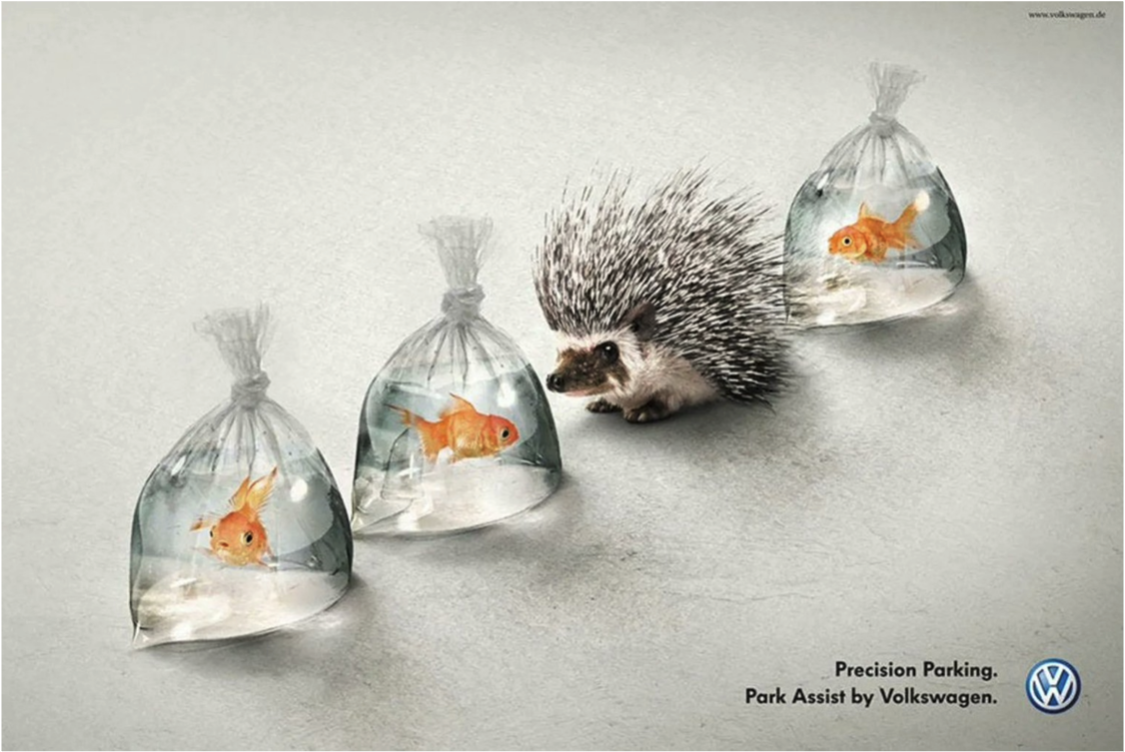
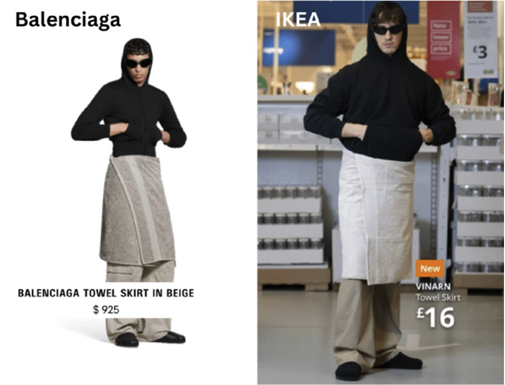
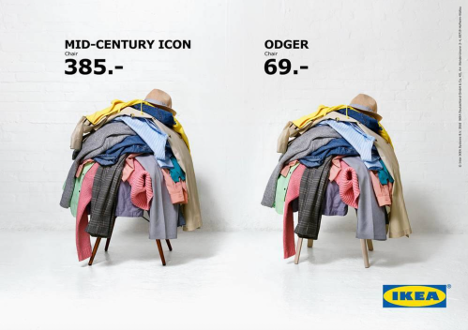
Comparative advertising examples: Why side-by-side sells
Put two things side by side, and our brains immediately start evaluating. What’s the difference? Which is better? That small mental exercise is effective.
Comparison turns passive viewing into active thinking, which makes things stick. The key is giving people something worth comparing. Two versions of the same outcome. Two perspectives. Two states. The gap between them is where the message lives.
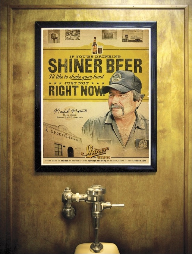
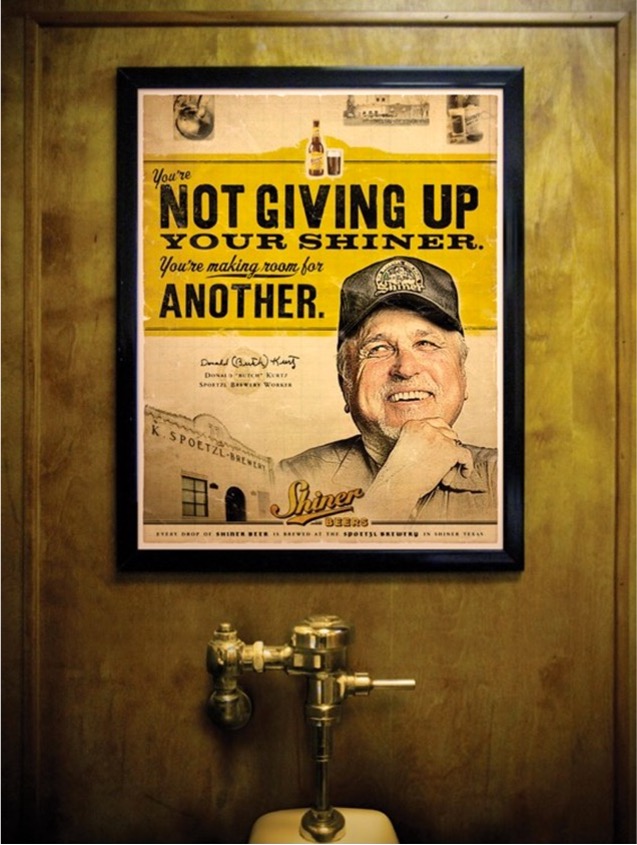
Ambient advertising examples: How location changes everything
Sometimes the setting is inseparable from the message. The environment doesn’t just frame the content, it completes it. The location becomes part of the creative.
This is worth thinking about every time you place a message. Where will someone see this? What will they be doing? What does the environment suggest about their state of mind? The answers change what you say and how you say it.
A checklist for creating compelling visual content
You don’t need a massive budget or a team of award-winning designers to apply these principles. Here’s a simple checklist for evaluating your own work before it goes out into the world. It doesn’t have to check all the boxes, but it should at least check some.
- Does it invite participation or discovery (a gap to close, a puzzle to solve)?
- Is this unmistakably built for a specific audience, not just broadly relevant?
- Could the image carry the message on its own, even without copy?
- If this uses copy, is the opening strong enough to make it hard to stop reading?
- Is there a contrast or comparison that makes the idea clear or memorable?
- Does the context or placement add meaning to the message?
- Would this stop me? Would it move me?
Those last questions are the most honest test you have. If the answer isn’t a clear yes, keep working.
Related:
How to make your message compelling
Message strategy makeovers
