Come November, holiday ads start popping up like chestnuts on an open fire. You probably remember a few favorites, forget the rest, and go on your merry way.
But our Counterpart elves always take a closer look. It’s their job to analyze, scrutinize, and strategize — year-round. And they’re always on a mission to better understand what makes a message effective.
As a fun festive assignment, our creative team assessed five holiday ads. Each group called out the four grinches of good message strategy: vain, vague, dull, and undisciplined. Then, they created new versions with our 4 Cs: customer-centric, clear, compelling, and controlled messaging.
LeMall
Kelly Valdez, Senior Writer
Jeff Blankenship, Senior Designer
 Credit source: Behance.net
Vain
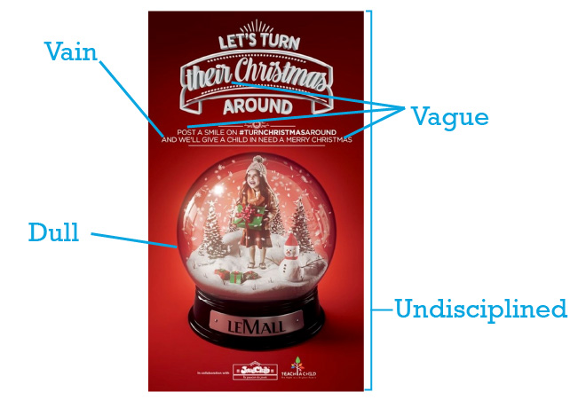
“And we’ll give a child in need a Merry Christmas.” Rather than making me feel good about doing a charitable thing, they take credit for it.
Vague
Who does “their” refer to? What does “Post a smile” mean? What does giving a child in need a “Merry Christmas” mean?
Dull
The snow globe is a familiar, made-you-look holiday thing. However, here it’s emotionally ambiguous.
Undisciplined
Compared to LeMall’s Instagram, this seems off brand. Most of those posts are lighthearted, with a more contemporary design style.

Customer-centric
All the copy is a call to action (CTA), with “you” implied as the subject of every sentence. “Share… Help… Donate… Spread… Visit.”
Clear
Icons quickly identify two specific actions: Donate to the toy fund and share on Instagram.
Compelling
Colors, textures, and glowing light add warmth.
Controlled
A more contemporary design style fits with their brand.
Paris belt
Brandon Davis, Creative Director – Writing
Casey Kennedy, Designer
Liz Fonville, Designer
 Credit source: christmasdesigners.com
Vain
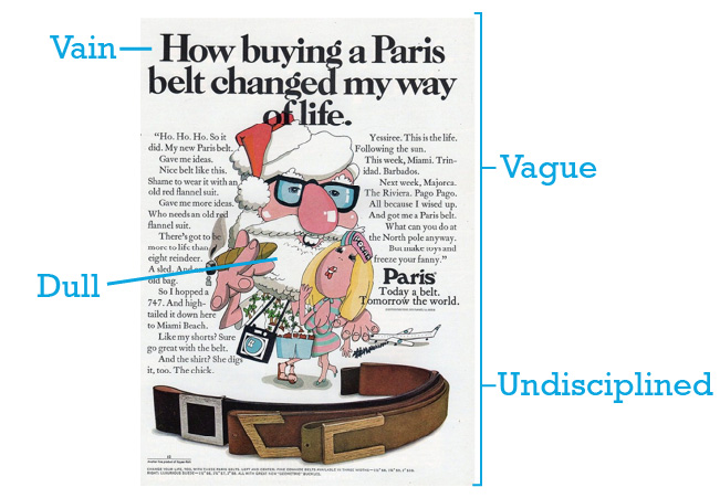
The ad from the 1970s sort of has a customer story, but doesn’t put them first. It’s all about the life-changing power of the belt.
Vague
Well, their intended message isn’t vague: Our belt changes you. It turned Santa into a jerk; now you can be a jerk, too. But there’s also a second message, which muddies things a bit: Our belt ruined Christmas. And there’s no clear CTA.
Dull
It grabs your attention, but for all the wrong reasons. Is this version of Santa appealing to anyone? (Even in the ’70s?) We’re all for having a brand mascot, but this isn’t it.
Undisciplined
It’s messy and busy. The type is so claustrophobic that it’s difficult to read. Everything overlaps everything else, adding to the chaos.
Customer-centric
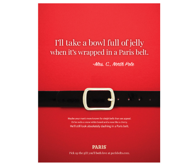
We targeted a different customer. Because is it men typically buying belts at the holidays, or should the content be geared to women?
Clear
There’s a clear message and CTA.
Compelling
It objectifies Santa (not the women he’s attracting with his belt) in a humorous way.
Controlled
Each element is intentionally designed in its own space.
PETA
Erin Stringer, Senior Technical Writer
Carolina Salcedo, Designer
 Credit source: peta.org
Vain
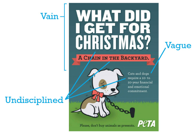
The ad is negative and uses shame to send the message. The customer is not the subject here and isn’t referenced until the CTA.
Vague
The copy isn’t clear. What exactly are you telling me? Oh, I see now, once I read the small line at the bottom of the page.
Dull
This ad actually is compelling. Giving animals as gifts is a real problem, and the headline catches your attention.
Undisciplined
The design isn’t controlled. We have three different fonts and two of them are “yelling” at us.

Customer-centric
We’re asking people to consider the consequences but speaking to them respectfully and compassionately.
Clear
It’s clear that the message is about giving pets as gifts. The headline and intro copy focus on the pet’s needs, not on the worst-case scenario.
Compelling
The headline and imagery of real pets catches your attention, and the copy and stats back up the main message.
Controlled
The message is structured, with a problem followed by proof (stats) and a solution (family decision). Not just “Don’t do this.”
Pringles
Alissa Heirigs, Associate Creative Director – Writing
Lyle Wardlaw, Senior Designer
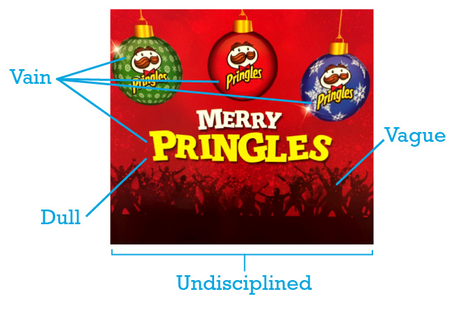 Credit source: Reddit.com
Vain
There are three logos, plus the product name in the headline.
Vague
Partying people at the bottom make us ask “Why is there a rave on this Pringles display?”
Dull
“Merry Pringles.” Not only is it not compelling (or clever), it doesn’t even make sense.
Undisciplined
The elements don’t feel connected. The logo usage feels random. The ornaments look skewed. And what is the concept here? Would love to see the brief that informed this. (Wethinks there was none.)
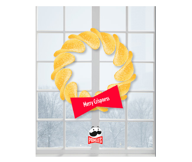
Customer-centric
There are fewer logos and no product name in the headline.
Clear
Using the product itself in the design makes it clear what we’re advertising.
Compelling
Seeing the product could make people want to taste the crispy goodness. And the headline highlights one of the best things about Pringles — they stay crispy (and whole) in the can.
Controlled
The mustache element of the logo and the brand color in the background create consistency.
Tesco
Jenny Demilio, Writer
Eric Wade, Senior Production Artist
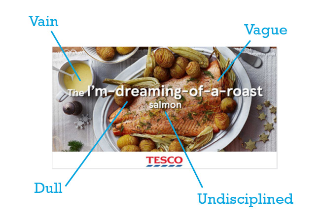 Credit source: sookio.com
Vain
It’s about the salmon, not the customer.
Vague
The structure and flow are a little weird, with “salmon” being all alone on the second line. And it’s not clear why I would buy salmon if I’m dreaming of a roast.
Dull
There are no verbs, and no imagery to make it immediately clear it’s for the holidays. The ad doesn’t really tap into any emotions. #KeepingItReal: The salmon does look de-lish! We don’t hate the image. (But do hate that the copy was slapped over it.)
Undisciplined
We were extremely offended by the placement of copy over the scrumptious salmon. Not to mention the weird font sizes and how they just threw “salmon” down there all by itself.

Customer-centric
The new ad uses “you” and speaks directly to the customer with imperatives. No “we,” “us,” or “our.” It’s conversational and not boastful.
Clear
Words and sentences are short and direct. One might accuse us of using a cliché (“Quit cold turkey”), but we feel like it works with the supplemental copy.
Compelling
Our word choices have some oomph: “This is how you quit…” The “Start a new tradition” copy taps into emotions and stories. The ad still relies heavily on the image of the very tasty-looking salmon.
Controlled
We were concerned “quit cold turkey” might come across as insensitive, but research suggested it’s so widely used that it’s safe. And it is used by Brits (the intended audience), not just Americans. We also researched previous ads for Tesco to get a feel for brand and legal vibes, and this seems to be on target.
Ready for your own message strategy makeover?
Whether you want a marketing refresh or a complete overhaul, find a counterpart to flatter your brand.
Contact us to start revamping what you say and how you say it.

