How to get results from a redesigned account creation page
FedEx account signup overhaul
FedEx account signup overhaul
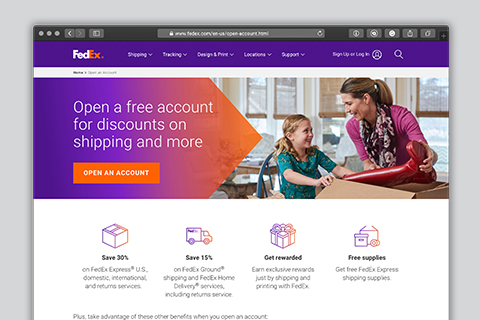
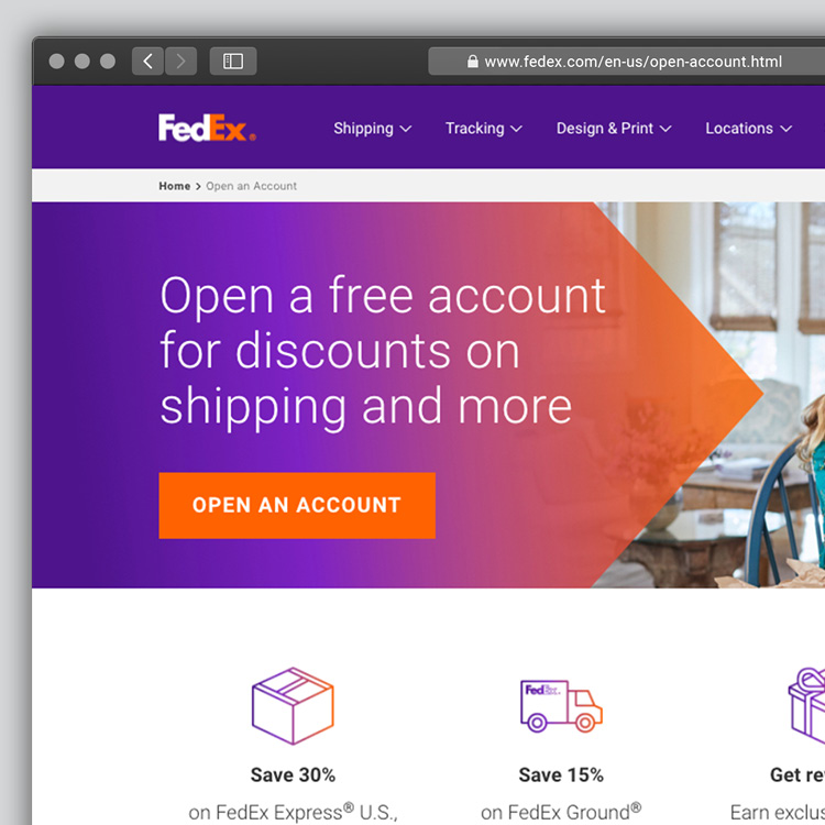
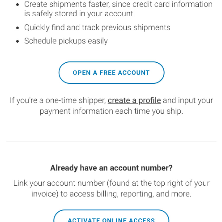
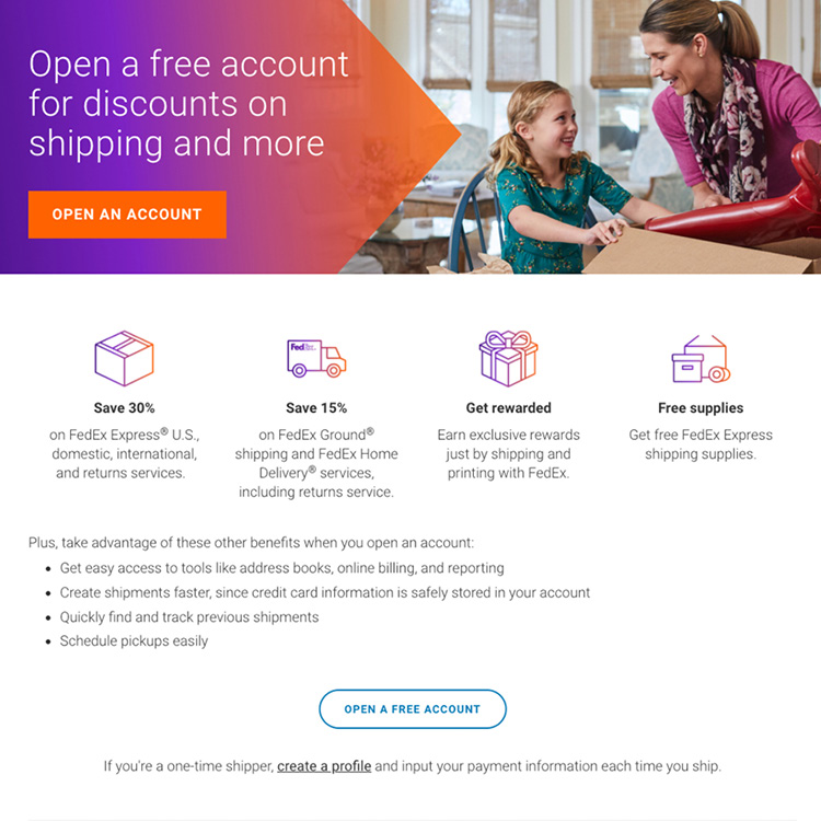
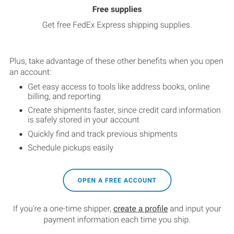
FedEx receives 4.8 million visitors a year to its open-account landing page, but only 32% of visitors were actually entering the workflow to sign up.* By giving visitors two equally weighted options — “sign up for an account” or “proceed as a guest” — the page wasn’t encouraging signups. And it didn’t emphasize the considerable benefits of having an account. (That was an issue on the referring pages as well … where there were referring pages. There were many missed opportunities in the linking strategy, too.) With a goal of increasing their conversion rate, they wanted to redesign the landing page and improve the way they were funneling traffic from other pages.
*During the control window
Counterpart provided:
How can you see similar success? With techniques like these:

 How to get results from a medical website redesign